Framework-Agnostic Design Systems
Using Lit Web Components in Angular
Hello Folks!
 Marco Pollacci Senior Frontend Developer


Frameworks come and go
BUT your Design System should stay!


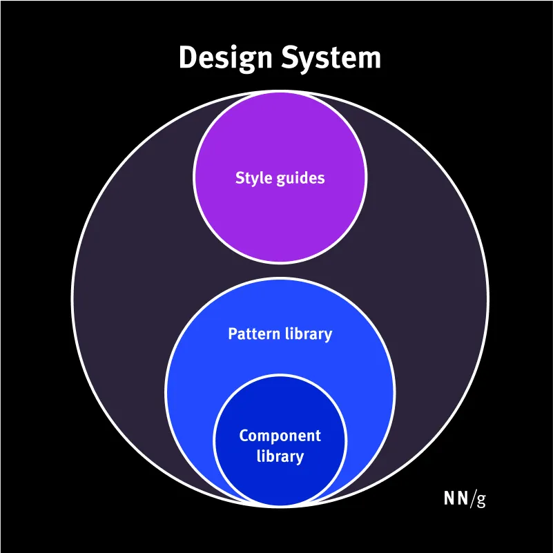
What exactly is a Design System?
🤨Design system
- 📌 Style guide
- 📌 Component library
- 📌 Pattern library
The Problem

Main problems with framework-specific components 🚨
- 📌 Vendor lock-in: components only work within that framework 🔗
- 📌 Costly rewrites if the framework changes or fades away ⚠️
- 📌 Risk of framework deprecation or discontinuation 🧩
- 📌 Reduced longevity: design system tied to framework lifecycle 🚫
- 📌 Slower adoption of new standards & browser features ⏳
Alright, thanks for the chaos! 😅
…so, what's our next move? 🤔
🥳 Lit 🥳
BUT FIRST
Web Components!!

A (not so) new standard 📋
- 📌 Introduced by W3C around 2013-2014
- 📌 Browser support matured by 2018+
- 📌 Today: fully supported in all modern browsers ✅
- 📌 Reusable across any framework (or without one)
They're here to stay. 🤘
The building blocks of Web Components 🏗️
-
📌 Custom Elements → define new HTML tag
<my-component> - 📌 Shadow DOM → encapsulate styles and markup
- 📌 HTML Templates → declare reusable DOM fragments
You already use them!

Even if you don't know it!
(or at least one of your 3rd party library does)...
Native browser elements <video>
    <video controls>
      <source
        src="....."
        type="video/webm"
      />
    </video>
Native browser elements <details>
Native browser elements
Hello from details
  <details>
    <summary>Native browser elements</summary>
    <p>Hello from details</p>
  </details>
And much more! ᕙ( •̀ ᗜ •́ )ᕗ
-
📌
<audio>— similar to video but for audio (with built-in controls) -
📌
<dialog>— native modal / dialog element with built-in APIs -
📌
<canvas>— drawing surface with isolated rendering context -
📌
<meter>,<progress>— built-in semantics for progress / measurement
Ecc..
Finally, Lit 🥳
A modern library for building fast, lightweight, and reusable Web Components.
Lit ✨
- 📌 A lightweight library (~5 KB gzipped)
- 📌 Makes writing components simpler and faster
- 📌 Fully standard-based: no framework lock-in
Since 14th October 2025
it's a OpenJS Foundation project 🚀
"Do more with less" ⚡
Lit embraces a minimalist philosophy: it builds on the web platform, adds only what's necessary, and stays out of your way for everything else.
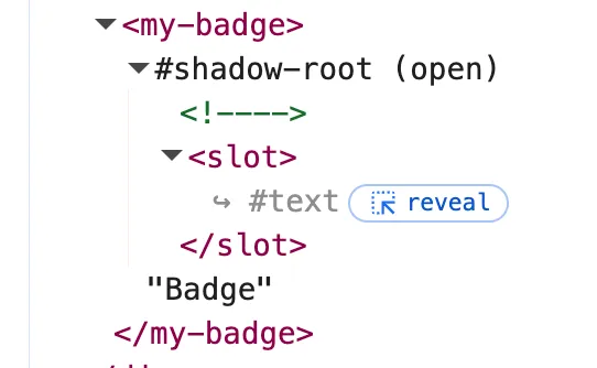
Our first Lit Web Component
(•̀ᴗ•́ )و
Let's Code 👨💻
  import { html, LitElement } from "lit";
  import { customElement } from "lit/decorators.js";

  @customElement("my-badge")
  export class MyBadge extends LitElement {
    render() {
      return html`<slot></slot> `;
    }
  }
Let's Code 👨💻
  //...
  @customElement("my-badge")
  export class MyBadge extends LitElement {
    static styles = css`
      :host {
        display: inline-block; padding: 0.25em 0.4em;
        font-weight: 700; text-align: center;
        border-radius: 0.25rem; color: #fff;
        background-color: #0d6efd;
      }
    `;
    render() {
      return html`<slot></slot> `;
    }
  }
<my-badge>Badge</my-badge>

Reactive Properties ⚡
@property()
This decorator allows the component to provide a configurable API, which can be set or updated by the component's users.
@property()
Properties can be fine-tuned with options
-
type: conversion (String, Number, Boolean, etc.) reflect: sync value to attribute-
attribute: custom attribute name (orfalse) -
converter: custom logic for attribute ↔ property
@state()
This decorator creates a private reactive field that exists only inside the component, and yet every time its value changes, Lit will still trigger a re-render.
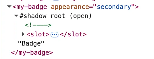
Let's Code 👨💻
  //...
  export class MyBadge extends LitElement {
    @property({ type: String }) appearance = "";
    static styles = css`
      :host {
        //other styles with default values and background...
      }
      :host([appearance="secondary"]) {
        background-color: #6c757d;
      }
    `;
    render() {
      return html`<slot></slot> `;
    }
  }
<my-badge appearance="secondary">Badge</my-badge>
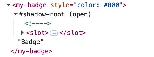
🥷🏿 Shadow DOM 🤝 Scoped Styles
- 📌 Shadow DOM: provides markup and style encapsulation. No more CSS leaks or conflicts.
- 📌 Scoped Styles: styles defined inside a component’s shadow DOM stay isolated. External CSS cannot leak in or unexpectedly change its appearance.
Let's Code 👨💻
  //...
  export class MyBadge extends LitElement {
    @property({ type: String }) appearance = "";
    static styles = css`
        //other styles with default values and background...
        slot {
            color: #fff;
        }
    `;
    render() {
      return html`<slot></slot> `;
    }
  }
<my-badge style="color: #000">Badge</my-badge>
Component Lifecycle

Lit components extend HTMLElement and follow its lifecycle. 😎
-
📌
connectedCallbackis called when the element is attached to the DOM. -
📌
disconnectedCallbackis called when the element is detached from the DOM. -
📌
attributeChangedCallbackis called when an attribute is changed.
Lit-Specific Lifecycle Hooks. 🔄
-
📌
willUpdate(changedProperties)is called before each update, with the changed properties -
📌
updated(changedProperties)is called after each update, with the changed properties -
📌
render()defines the component's template and returns HTML. -
📌
firstUpdated(changedProperties)is called after the first render.
Event Handling 📢
Handling events in Lit is straightforward. ✨
Bind events directly in the template using the custom @ syntax.
Let's Code 👨💻
//... export class MyButton extends LitElement {#handleClick() { console.log("Button clicked!"); }render() { return html` <button @click=${this.#handleClick}> Click me! </button> `; } }
🔔 Event handling in Shadow DOM 🔔
Encapsulation ≠ Isolation: some events can bubble outside the shadow boundary.
-
✅ Bubble through:
click,input,changecan be listened outside the shadow root. -
❌ Stay inside:
mouseenter,mouseleave,focus,blurdo not escape the shadow root.
Directives 🛣️
Directives are special functions in Lit that can customize how template parts are rendered.
They are a powerful tool for conditional rendering, looping, async data fetching, and creating reusable template logic
✧。٩(ˊᗜˋ )و✧*。
Why directives?
- 📌 Reusability: Package complex template logic into a reusable function.
- 📌 Performance: Many built-in directives are optimized to minimize DOM updates.
- 📌 Expressiveness: Make your templates more declarative and easier to read.
Some Built-in directives
🔁 repeat
🧩 when
⚙️ map
Let's Code 👨💻
//... import { repeat } from 'lit/directives/repeat.js';export class MyList extends LitElement { items = [{ id: 1, name: 'Alice' }, { id: 2, name: 'Bob' }];render() { return html` <ul> ${repeat( this.items, (item) => item.id //<-- Key function for efficient updates (item) => html`<li>${item.name}</li>` )} </ul> `; }}
🚀 Integration 🚀
Lit without any framework 🚀

Let's Code 👨💻
    <!DOCTYPE html>
    <html lang="en">
    <head>
        <script type="module" src="./my-badge.js"></script>
    </head>
    <body>
        <my-badge appearance="secondary">Badge</my-badge>
    </body>
    </html>
Lit ♥️ Angular
Angular + Lit: what's the deal?
Agular has its own component model and template compiler
By default, Angular only recognizes known Angular components
...Angular thinks it's just an unknown HTML tag
(ᵕ—ᴗ—)
How to make Angular accept Lit components? 🤨
We need to teach Angular that custom elements are valid
Angular provides a special schema:
CUSTOM_ELEMENTS_SCHEMA
With this schema, Angular stops complaining 👌
Let's Code 👨💻
        import { Component, CUSTOM_ELEMENTS_SCHEMA } from '@angular/core';
        @Component({
          selector: 'app-root',
          template: `<my-badge appearance="secondary">Badge</my-badge>`,
          schemas: [CUSTOM_ELEMENTS_SCHEMA]
        })
        export class AppComponent {}
And now...how to import the Library?
From CDN 🌏
Let's Code 👨💻
    <html lang="en">
    <head>
        <meta charset="utf-8" />
        <title>My Angular App</title>
        <base href="/" />
        <meta name="viewport" content="width=device-width, initial-scale=1" />
        <link rel="icon" type="image/x-icon" href="favicon.ico" />
        <script src="https://cdn.example.com/my-lit-library.js"></script>
    </head>
    <body>
        <app-root></app-root>
    </body>
    </html>
From NPM 📦
Let's Code 👨💻
    import '@my-org/my-lit-library/my-lit-library.js';
    import { bootstrapApplication } from '@angular/platform-browser';
    import { appConfig } from './app/app.config';
    import { App } from './app/app';

    bootstrapApplication(App, appConfig).catch((err) => console.error(err));
So... integration done? 😎

There's still one more thing!
custom-elements.json
What is custom-elements.json?
It's a metadata file that describes your Web Components.
A standard way to document Web Components 📖
It includes details like:
- 📌 Component names & tags
- 📌 Properties, attributes, and types
- 📌 Events, slots, CSS parts
How do we create custom-elements.json?
We can use a library that scans your components and produces the JSON
✧。٩(ˊᗜˋ )و✧*。//install library npm install --save-dev @custom-elements-manifest/analyzer//add script to package.json "analyze": "cem analyze --litelement",//then, run the script npm run analyze
🎉 Done! 🎉
And now we finally have custom-elements.json 🎉
...but wait 👀

custom-elements.json + VS Code ♡
How do we make it work?
custom-element-vs-code-integration
//install library npm install --save-dev custom-element-vs-code-integration//create script custom-vscode.js import { generateVsCodeCustomElementData } from "custom-element-vs-code-integration"; import manifest from "./path/to/custom-elements.json"; const options = {...}; generateVsCodeCustomElementData(manifest, options);//modify script to package.json "analyze": "cem analyze --litelement && node custom-vscode.js",//then, run the script analyze agaiin npm run analyze

The future of Design Systems
🌐 Native adoption of Web Components keeps growing
🧩 More tooling & integrations will simplify cross-framework use
🚀 Companies are already moving to framework-agnostic libraries
The earlier you start, the easier the transition.

You can see this slide on

Questions? ✨
@customElement("q-and-a")
class QandA extends LitElement {
render() {
return html`<p>Waiting for your questions... 🙋♀️</p>`;
}
}
Thank you again!
Marco Pollacci Senior Frontend Developer Leave some feedback